Accordions
Accordions are disclosure controls used to expand and collapse (show and hide) content.
Impacted Users
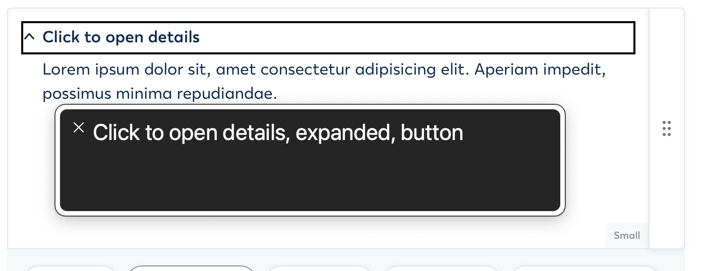
Screen reader users need to hear the expanded or collapsed state of the accordion so they know when it's opened or closed.
Users with cognitive disabilities need the ability to hide content that may be cluttering the page.
Keyboard users need accordions to be keyboard focusable and operable to expand and collapse.
Designers
Annotate accordions in your designs with an expanded and collapsed state or using details summary elements.
Accordions need to be annotated with an expanded and collapsed state, e.g. adding aria-expanded=true/false or using details summary elements.
✅ Do
- Annotate accordions in your design using aria-expanded or details summary elements.
Good Design Example
Screenshot from the figma example.
❌ Don't
- Don't design accordions without annotating an aria-expanded state or using details summary elements.
Bad Design Example
Screenshot from the figma example.
Live Figma Example
Link to Figma example
Testing for Accessibility
Design Review
- Look for ... in the design.
- Make sure ... is annotated in the design.
- Make sure ...
- If ... is properly annotated in the design then it passes. ✅
- If ... is not annotated in the design then it fails. ❌
- If ... then it passes. ✅
- If ... then it fails. ❌
Content Designers
Code accordions as details summary elements with meaningful details text.
Use details summary elements to create accordions because that control is keyboard and screen reader accessible by default.
✅ Do
- Code accordion controls as details summary elements.
- Write meaningful details text for the accordion button.
Good Content Example
See the Pen Accordion - Good Example by Paul J. Adam (@pauljadam) on CodePen.
Live Good Content Example
Accordion - Good Example❌ Don't
- Don't code accordions without using details summary elements.
- Don't create accordions without writing meaningful details text for the accordion button.
Bad Content Examples
See the Pen Accordion - Good Example by Paul J. Adam (@pauljadam) on CodePen.
Live Bad Content Example
Testing for Accessibility
Using Web Inspector
- Right Click > Inspect ... on the page.
- Make sure ...
- Make sure ...
- If ... then it passes. ✅
- If ... then it fails. ❌
Using Screen Reader
- Use the screen reader to navigate to ...
- Make sure ...
- Make sure ...
- If ... then it passes. ✅
- If ... then it fails. ❌
Developers
Code accordions as native details summary HTML elements or use aria-expanded on a button if native control can't be used.
Native details summary elements are keyboard and screen reader accessible by default. Details summary elements manage the expanded and collapsed state for screen readers without requiring any JavaScript. Don't use ARIA to create accessible accordions unless using native HTML details summary elements is not possible.
✅ Do
- Code accordions as native details summary elements.
- Use aria-expanded on a button if native details summary can't be used.
Good Code Example
See the Pen Custom Accordion - Bad Example by Paul J. Adam (@pauljadam) on CodePen.
Live Good Code Example
❌ Don't
- Don't code accordions out of non-focusable elements like div or span.
- Don't use ARIA to code accessible accordions unless native details summary elements can't be used.
- Don't code accordions that are missing an expanded and collapsed state.
Bad Code Example
See the Pen Custom Accordion - Bad Example by Paul J. Adam (@pauljadam) on CodePen.
Live Bad Code Example
Testing for Accessibility
Using Web Inspector
- Right Click > Inspect ... on the page.
- Make sure ...
- Make sure ...
- If ... then it passes. ✅
- If ... then it fails. ❌
- If ... then it passes. ✅
- If ... then it fails. ❌
Using Screen Reader
- Use the screen reader to navigate to ...
- Make sure ...
- Make sure ...
- If ... then it passes. ✅
- If ... then it fails. ❌
Disabilities Affected
Assistive Technologies Applicable
Design System Documentation
Collapsible | Duet Design System